Working in Reports
Reading and using Dashboard reports is easy and intuitive thanks to several navigational tools available. Regardless of report, all are provided in the same general layout. Reports in the Dashboard consist of rows, columns, headers, buttons, icons and links. By learning the layout, you can create, understand, and use all your reports quickly.
Drill down/Drill Up Arrows
 The directional arrows displayed for
each row indicate the different levels and relationships between your EDI data. In our example
below, clicking down from the Interchange report eventually brings us to the Message report; at
that point only the up arrow is available since the message is the lowest level of data in an
EDI Document set.
The directional arrows displayed for
each row indicate the different levels and relationships between your EDI data. In our example
below, clicking down from the Interchange report eventually brings us to the Message report; at
that point only the up arrow is available since the message is the lowest level of data in an
EDI Document set.

Report Icons
Several icons are available for reports. By clicking an icon, different types of information is displayed for that specific row. Each icon has a related purpose:
| Icon | Description |
|---|---|
 |
Click to view raw EDI data. |
 |
Click to view transaction error or status messages. This view applies to EEI reports only. |
 |
Click to view the Message Audit View. This displays the Connection, Interchange, Group, and Application details of the transaction, as well as an overall summary details section. |
 |
Click to view the User View, which provides a more user-friendly view of EDI data (mainly by applying segment/element labels). This view applies to EEI reports only. |
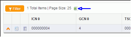
Exporting reports
Reports can be exported to a spreadsheet by clicking the spreadsheet icon located at the top of each report, as shown here.
Multiple page reports
Depending on the amount of data in a report, it may be displayed in multiple pages. Use the page navigation tool, shown here, to view all pages. This can be found at the top right of each report, when applicable.
